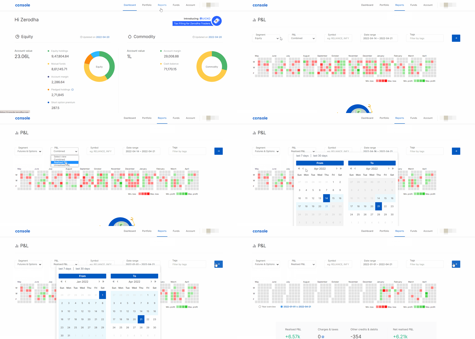
The profit and loss heatmap on Console represents your daily gross profit and loss (P&L) reports. The P&L uses two distinct colours: green indicating profits and red indicating losses. Lighter shades indicate smaller daily profits and losses, while darker shades represent larger profits and losses.
How to view or download the P&L report and heatmap on Console
Follow these steps:
- Log in to Console.
- Click on Reports.
- Click on P&L.
- Select Segment and Date range.
- Click on the Arrow to view the P&L.
You can download the P&L report as Excel by clicking on Download .

The value displayed when you hover on the tiles is the gross realised P&L for the particular day.


